
What is the first thing that comes to your mind when you see the word ‘chart’? You must be thinking about pie charts, right? While pie charts are convenient in many cases, in the world of Forex, we deal with some other types of charts.
Before we move forward to know more about the Forex charts, let’s first try to understand what a chart is.
A chart is a visual representation of data which is presented in the form of a graph, a bar chart or a diagram.
So why do we need a chart?
A chart helps us to understand what took place in a certain period without going through the hustle of analyzing all the data. It shows us all the data that has been gathered to date without making any potential mistake. Thanks to advanced database software, we don’t even have to go the extra mile and can easily get our job done by just inputting the accumulated data. We can easily study the market by looking at the previous inputs in a chart and it also helps us to forecast the market beforehand.
These charts help us to learn about the fluctuation in prices in supply and demand. Since the value of money in Forex is always changing, maintaining a chart helps you to keep a track of these sudden changes and make future assumptions by studying these changes. For instance, let’s say the buying price of an object was $10 and for making a 20%, it needs to be sold at $12. For that, we take a look at our charts and we see that the market value of the product is constantly fluctuating and now, the price is on the rise. However, the recent data shows that if we are to sell the product now, we’ll gain a 10% profit. But, if we wait for a couple of days more, we can assume that the price of the product will increase to make a 20% profit.
And if our assumption becomes true, we can say, it’s all thanks to the charts that made this possible! But remember, you need a premium ETF account to trade in Hong Kong. So, choose a great broker like Saxo to ensure you use high-end tools in trading.
Now, what types of charts we need in the Forex market?
If you are interested in Forex and want to win some profits then you should definitely try learning to study the market better. Let’s share a secret. Knowing about the charts can improve your understanding of the market.
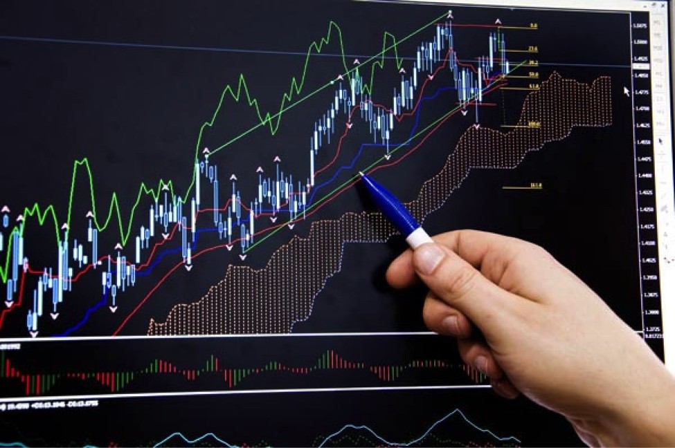
While several charts are used to analyze data, the three most popular charts used in Forex trading are:
1. Line Chart
The bookish definition of a line chart goes like this, ‘The chart that displays information as a series of connected straight lines in a continuous line.’ It is one of the most used charts because of its simple mechanism.
In this chart, a straight line is drawn from one closing price to another closing price. So, if a straight line goes downward, we can understand that the value of a commodity has fallen in comparison to the previous price. On the contrary, if any straight line goes upward, it will indicate that the value has increased from the previous price. A line chart is convenient to understand the fluctuation in market prices. However, there is little scope for viewers to gather more information from the chart.
More or less, we can say that the main objective of this chart is to visually compare the value of a commodity over time.
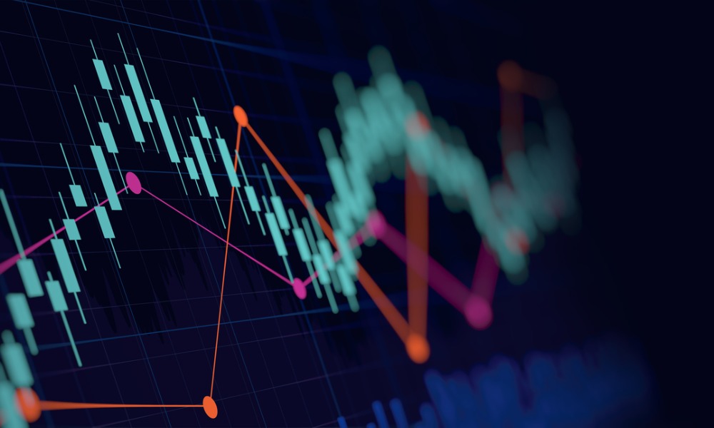
2.Candlestick chart
Candlestick chart is a type of chart where information is expressed as candles and each candle represents the rate of changes in price in a fixed period.
In this chart, there are two types of candles, i.e. Bullish candle and Bearish candle.
Let’s say, the opening price of a commodity was $10 and after one week, it became $15 due to its demand. However, in the following week, the price dropped to $8.
Now, if the closing price of any commodity increases in a specific period of time, then it’s denoted by a bullish candle. Here, an increase in price from $10 to $ 15 will be shown in a bullish candle.
On the other hand if the closing price is less than the previous one, it will be denoted by a bearish candle. So, a decrease in price from $15 to $8 will be shown in a bearish candle.
In a candlestick chart, the candles are arranged in different colors depending on the type of candle. So, anyone can understand the market turning points easily by observing them.
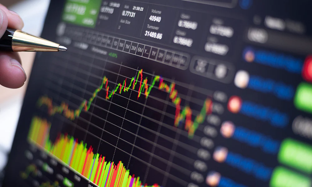
3. Bar Chart
A bar chart is a bit complex chart where a trader can observe all the price ranges of a commodity in each period.
In this chart, the bottom-most line indicates the lowest traded price while the topmost line indicates the highest traded price. The size of the bars in a bar in a bar chart vary due to the fluctuations of the market price. If the fluctuations increase, then the bars become taller in size and if the price range doesn’t fluctuate much, the bars become shorter.
One plus point to this chart is that it shows the opening and closing price of products in horizontal lines.
Conclusion
Imagine you want to analyze the ETF market and are now sitting in the middle of piles of sheets containing the data. What are you going to do? Do you want to go through all the piles just to know the fluctuations in market price or get traumatized and give up? To help you not don’t give up, the charts are here to help you with all the data. So, fasten your seatbelts and start learning to read the charts because you still have a long way to go.


Comments